ReTooj
A mobile concept for more informed fashion decisions.
ReTooj explored how a shopping assistant could help people make quicker but more responsible clothing choices. The core idea was a simple scoring logic: instead of leaving users alone with scattered product data, the app translated quality, composition and sustainability criteria into a clear decision aid.
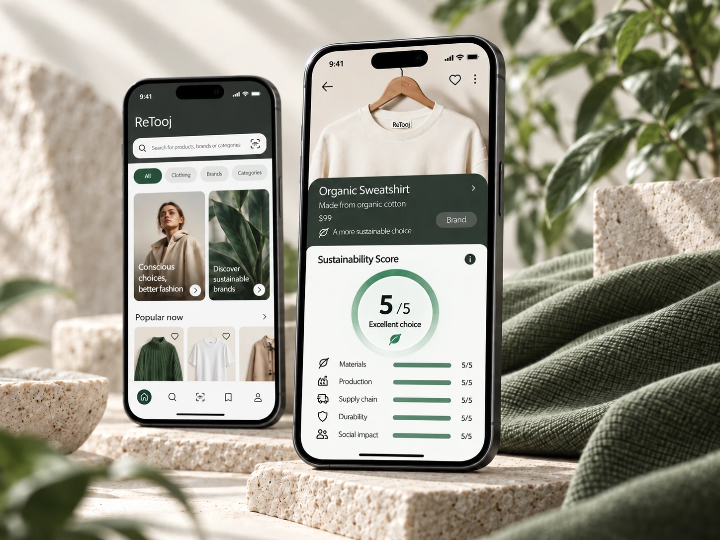
Making a purchase more considered.
The starting point was excessive consumerism in the clothing market and the gap between good intentions and real purchase behaviour. People wanted to buy better, but in practice they were comparing too many factors at once: fabric quality, composition, price, reviews and environmental impact.
The project goal was to reduce cognitive load and support faster, better-informed choices — not through moralising, but through useful structure and a decision framework that felt easy to use in context.
A broad research base before any design direction.
The first phase was conducted by a team of three and focused on understanding how people actually make clothing decisions rather than immediately defining features or screens.
The work combined desk research, quantitative source review and six in-depth interviews focused on shopping habits, decision criteria and digital behaviour. We looked at sources of trust, attitudes towards more conscious shopping and the moments in which evaluating a product became difficult or time-consuming.
The research revealed an important tension: good intentions did not automatically translate into purchase behaviour. Convenience, price, perceived quality and the effort required to interpret information still shaped the final decision.
Material quality drives trust.
Fabric quality and composition repeatedly appeared as important signals when people assessed whether a product felt worth buying.
Reviews reduce uncertainty.
External opinions and product feedback helped validate choices when users did not feel confident evaluating an item on their own.
Intent and behaviour diverge.
People could care about more responsible consumption while still prioritising convenience, price or speed in the moment of purchase.
Useful guidance matters more than more information.
The opportunity was not to add another layer of content, but to organise complex information into something quicker to understand.
Turning research into a focused product opportunity.
The research produced many individual observations. The important design task was deciding which of them should influence the product and which would only add complexity.
During synthesis, recurring patterns were grouped around three needs: understanding the product, comparing the information that matters and reaching a decision without researching every factor independently.
What am I actually buying?
Make product quality and composition easier to interpret.
How does this option perform?
Create a consistent structure that makes alternatives easier to evaluate.
Can I reach a conclusion quickly?
Reduce the amount of independent interpretation required from the user.
Turn complex product criteria into a clear first signal — while keeping the underlying information available when users want to look deeper.
One strong product logic: scoring.
The second phase was developed by a team of two. Research insights were translated into a more focused product concept, information architecture and interface direction.
The key idea became a scoring system. Instead of asking users to independently interpret many pieces of product information, ReTooj brought them together into one understandable overview and made the reasoning available when more detail was needed.
From scattered information to a clearer choice.
The experience was organised around two levels of information. At first glance, users could read an overall evaluation. When they needed more context, they could look deeper into the information behind it.
The intention was to balance speed with transparency: provide a useful first signal without hiding the detail that supports it.
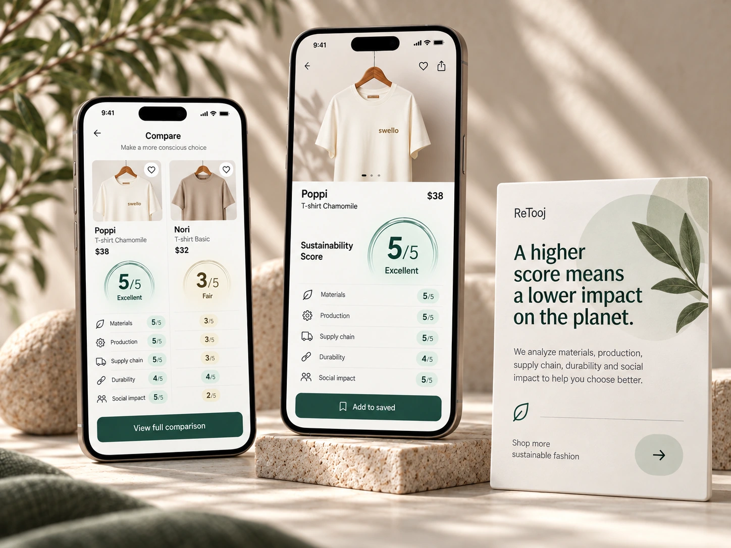
A calm interface built around the decision.
Once the product logic was established, the interface was developed around the moments that mattered most: discovering a product, finding information quickly, understanding its evaluation and deciding what to do next.
The visual system stayed deliberately restrained, using clear hierarchy and repeatable patterns to keep the experience easy to scan.
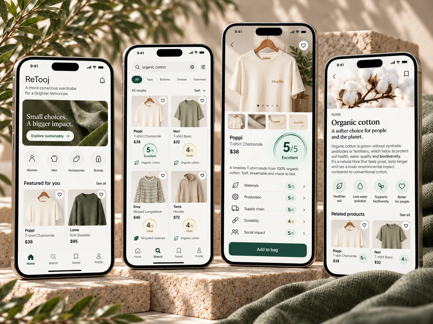
Discovery, search, product evaluation and learning content show the breadth of the experience at a glance.
Testing the flows, not just the screens.
The high-fidelity prototype was tested with five participants across three tasks. The aim was to check whether core actions were understandable and whether the interface supported users without requiring explanation.
The interaction became easier to understand when the heart action was paired with an explicit removal cue.
Categories, a clearer route to all articles and persistent navigation improved findability.
A concept built around one clear decision.
ReTooj evolved from a broad exploration of conscious shopping into a more focused proposition: help users understand a clothing choice more quickly without removing the complexity behind it.
The project connected research, synthesis, product logic, prototyping and usability testing into one coherent design process. As an academic concept, its value lies in the reasoning and system behind the interface rather than in claiming a market outcome.
Research synthesis, concept framing, product thinking, UX/UI design, visual system development and presentation design.