Worth keeping.
Designed to gather meaning through use rather than feel immediately replaceable.
A co-created brand for sentimental objects designed to stay.
Enclosed was developed by Alicja and Konrad Kordas around the idea of emotional durability: everyday objects can gain value through use, memory and ritual. Visual identity and product design were developed together so that the same logic could shape both communication and the objects themselves.
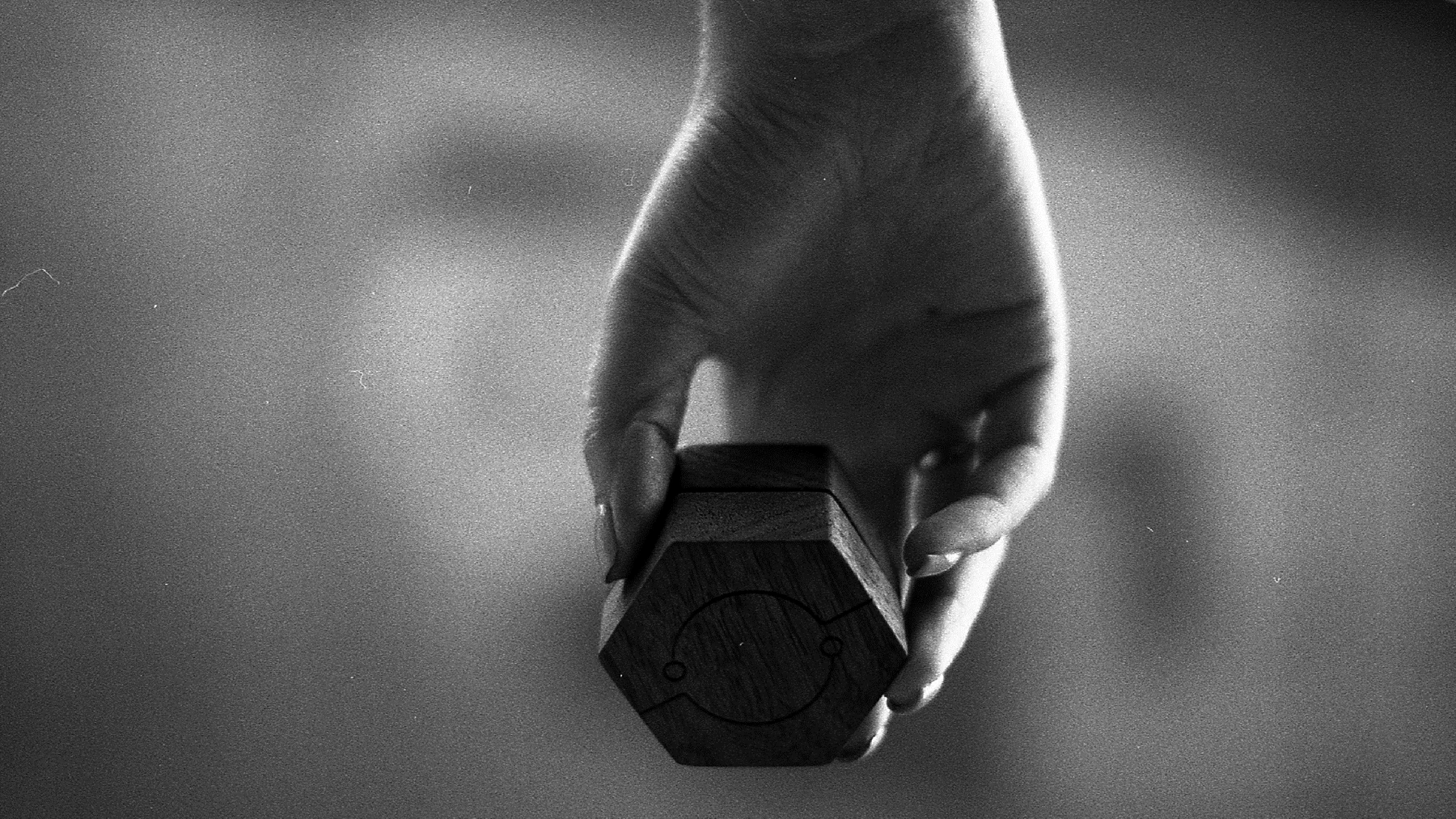
Enclosed treats longevity as both physical and emotional. The aim was to create objects that feel worth keeping because they age well, invite touch and accumulate personal meaning.
Three actions shaped the brand from the beginning — Surround. Wrap. Protect. They describe more than function: they frame the relationship between object, user and memory.
Designed to gather meaning through use rather than feel immediately replaceable.
Natural materials and calm forms are chosen to remain relevant and tactile over time.
Small gestures around opening, wrapping and storing become part of the experience.
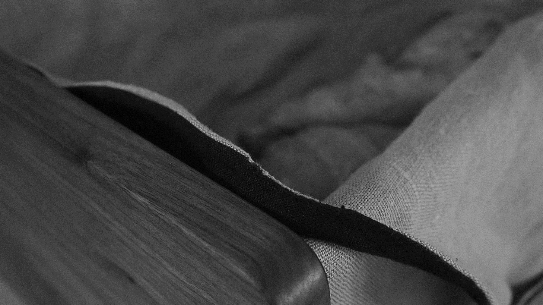
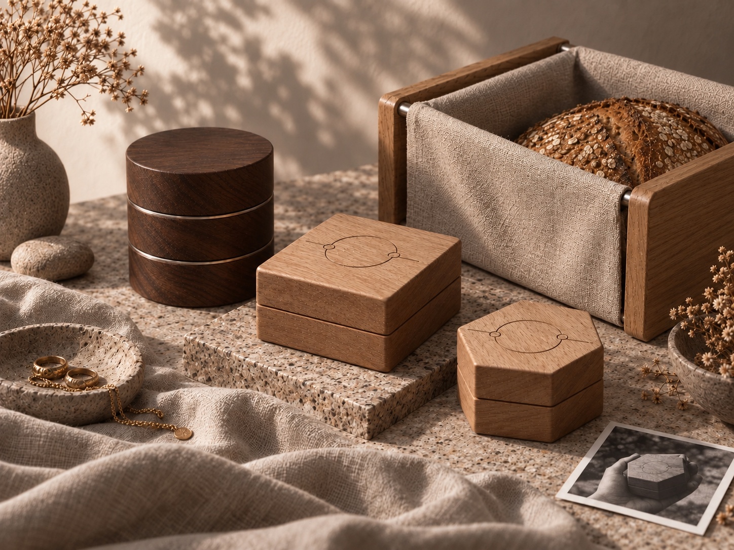
Wood, linen and small metal details were selected for the way they feel, wear and change with use. Their tactility supports the brand idea more strongly than polished, disposable finishes could.
Mechanics follow the same logic. Concealed magnets and discreet closures keep the object visually calm, while the interaction reveals itself through touch.
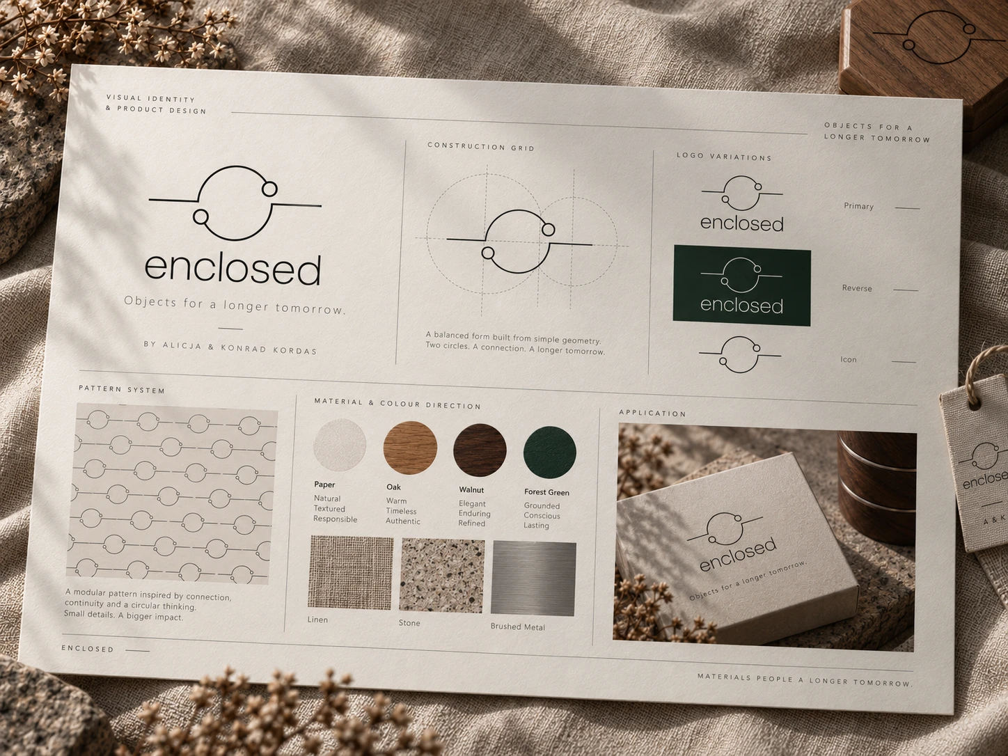
The visual identity is built from three elementary components: a circle, a horizontal connection and two nodes. Together they translate the brand idea into a graphic system rather than a standalone logo.
The circle suggests enclosure and care. The connecting line introduces continuity. The two nodes make the symbol relational rather than closed — an important distinction for a brand centred on attachment and long-term use.
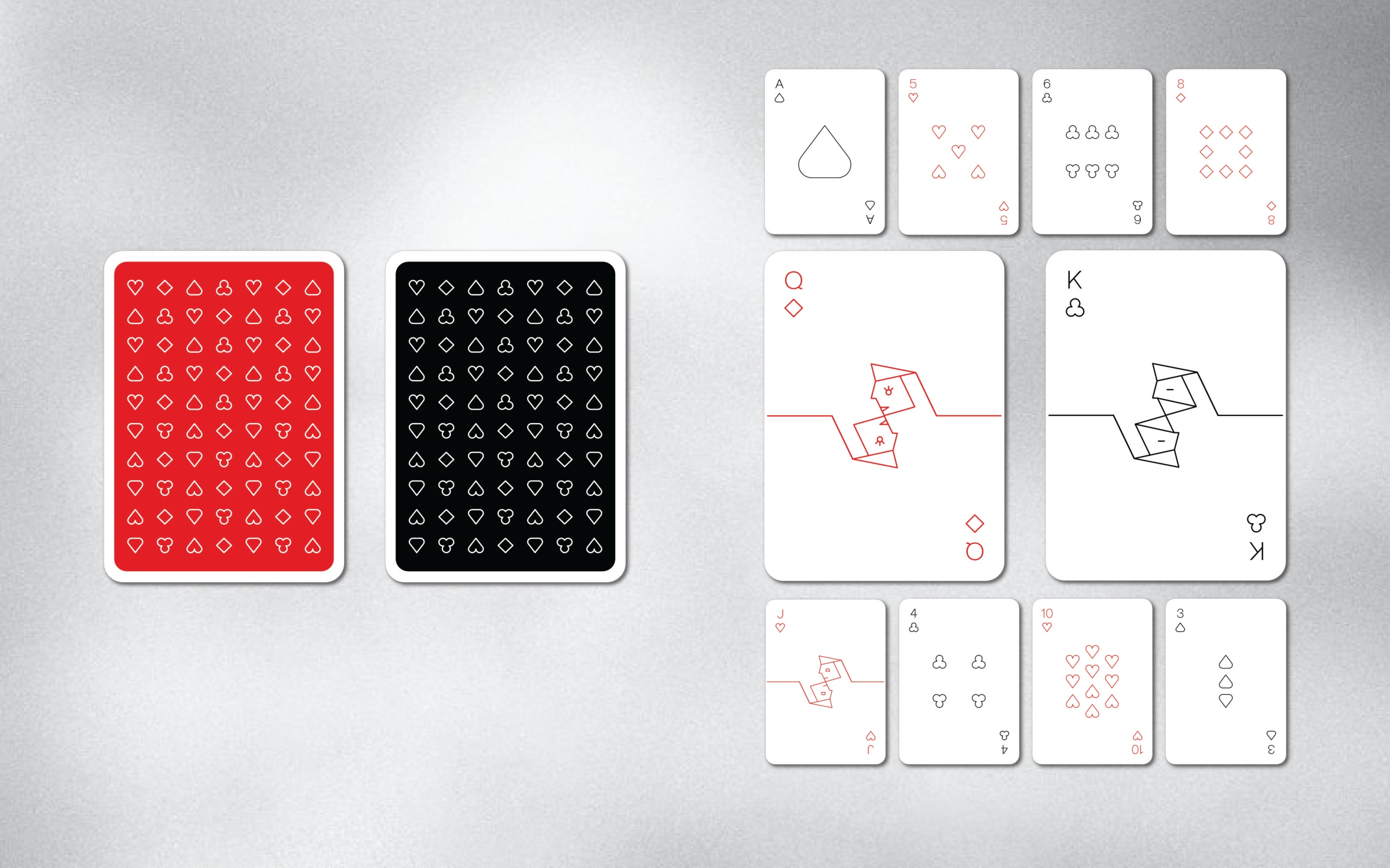
The playing-card series became a deliberate stress test for the identity. The same line-and-node grammar had to generate symbols, figures and rhythm without losing the visual logic established by the mark.
This made the system useful beyond the logo itself: it could become abstract, figurative or repetitive depending on the application, while still feeling unmistakably Enclosed.
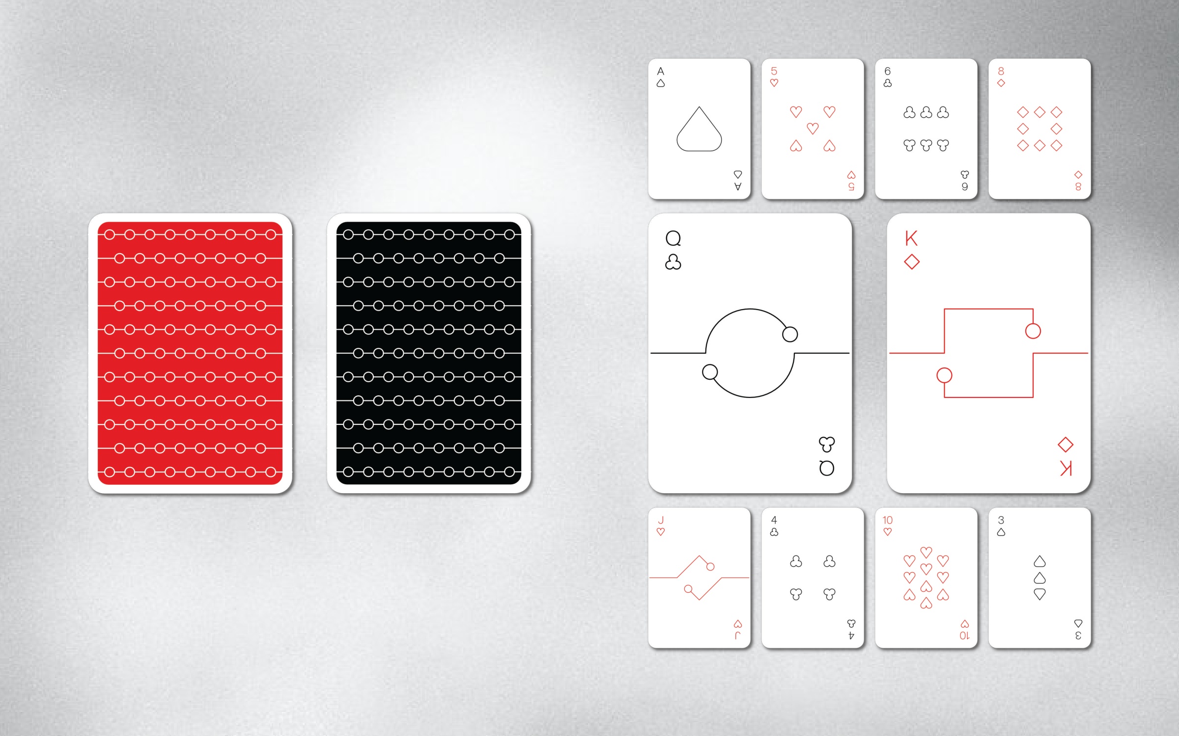
Two playing-card directions explore how a shared geometric language can create suits, court figures and repeating backs. Each direction balances recognisable symbols with a distinctive treatment of line, rhythm and character.
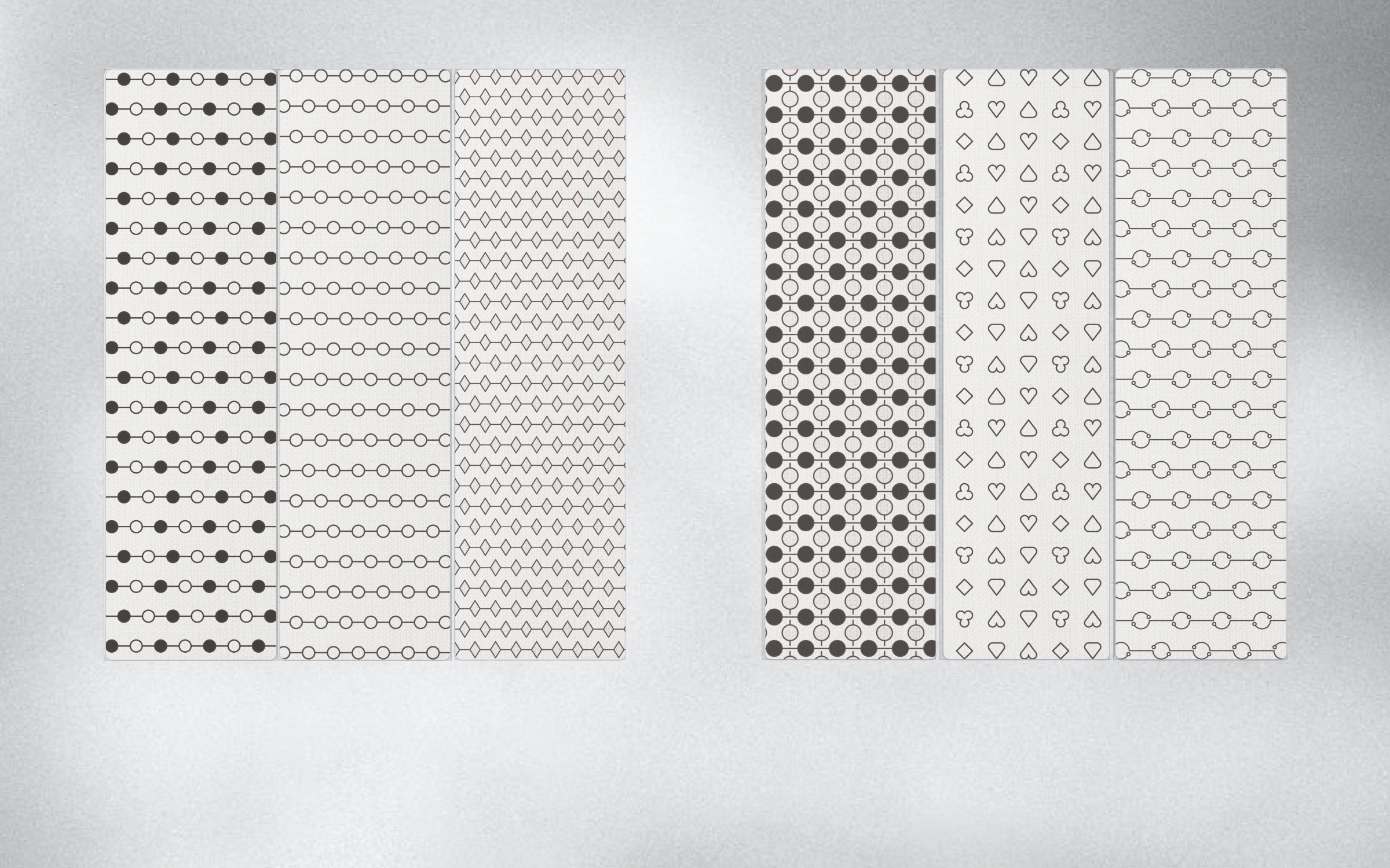
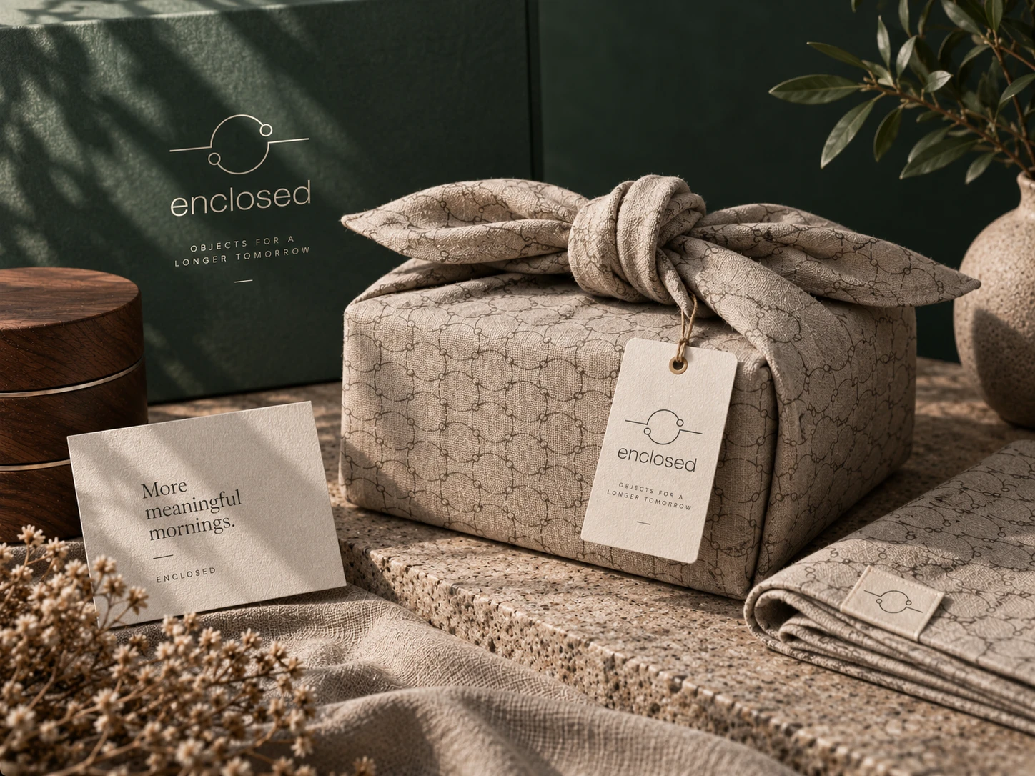
A furoshiki-inspired textile wrap extends the original “wrap” principle into packaging. The cloth is not only a surface for the identity pattern; it also turns unwrapping into a slower, more deliberate gesture.
The concept reduces the separation between packaging and product. Textile, pattern and ritual all belong to the same brand experience.
The jewellery boxes are compact containers for things worth holding onto. Their form is deliberately calm, while the opening sequence is less obvious and discovered through touch.
Hidden magnets keep the exterior clean, circular inserts can be stacked and rearranged, and the engraved identity becomes part of the object rather than an applied label.
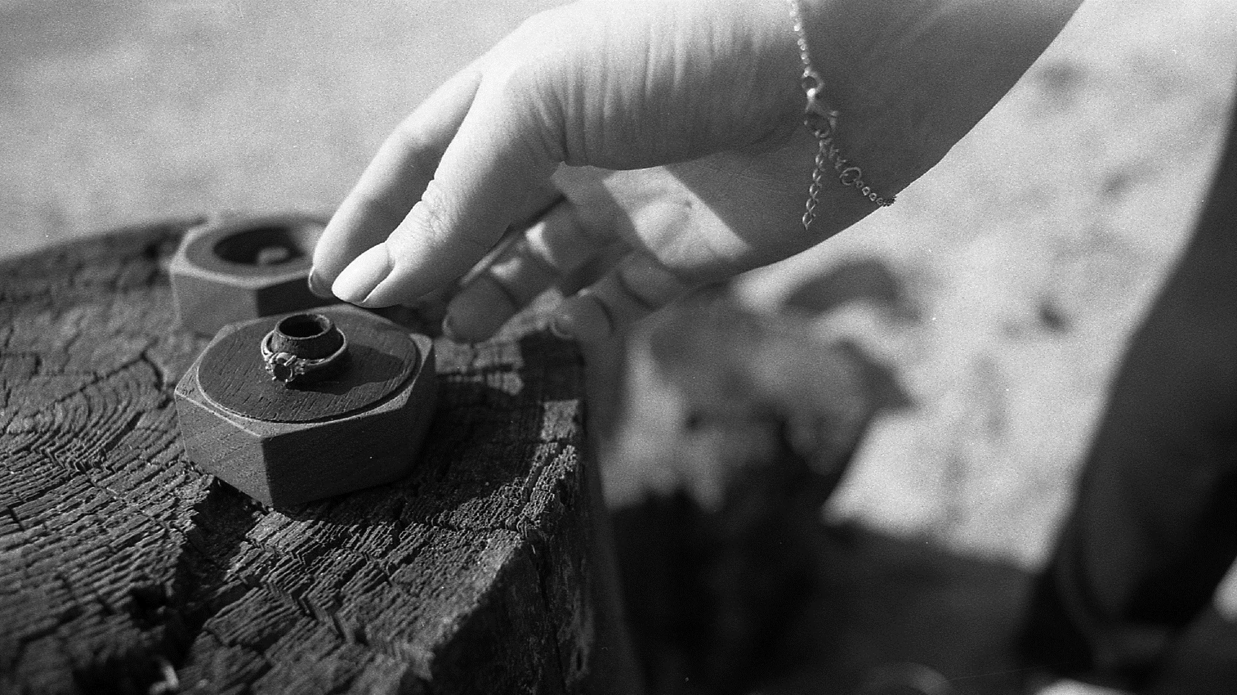
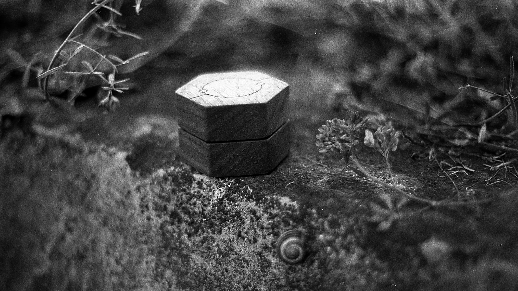
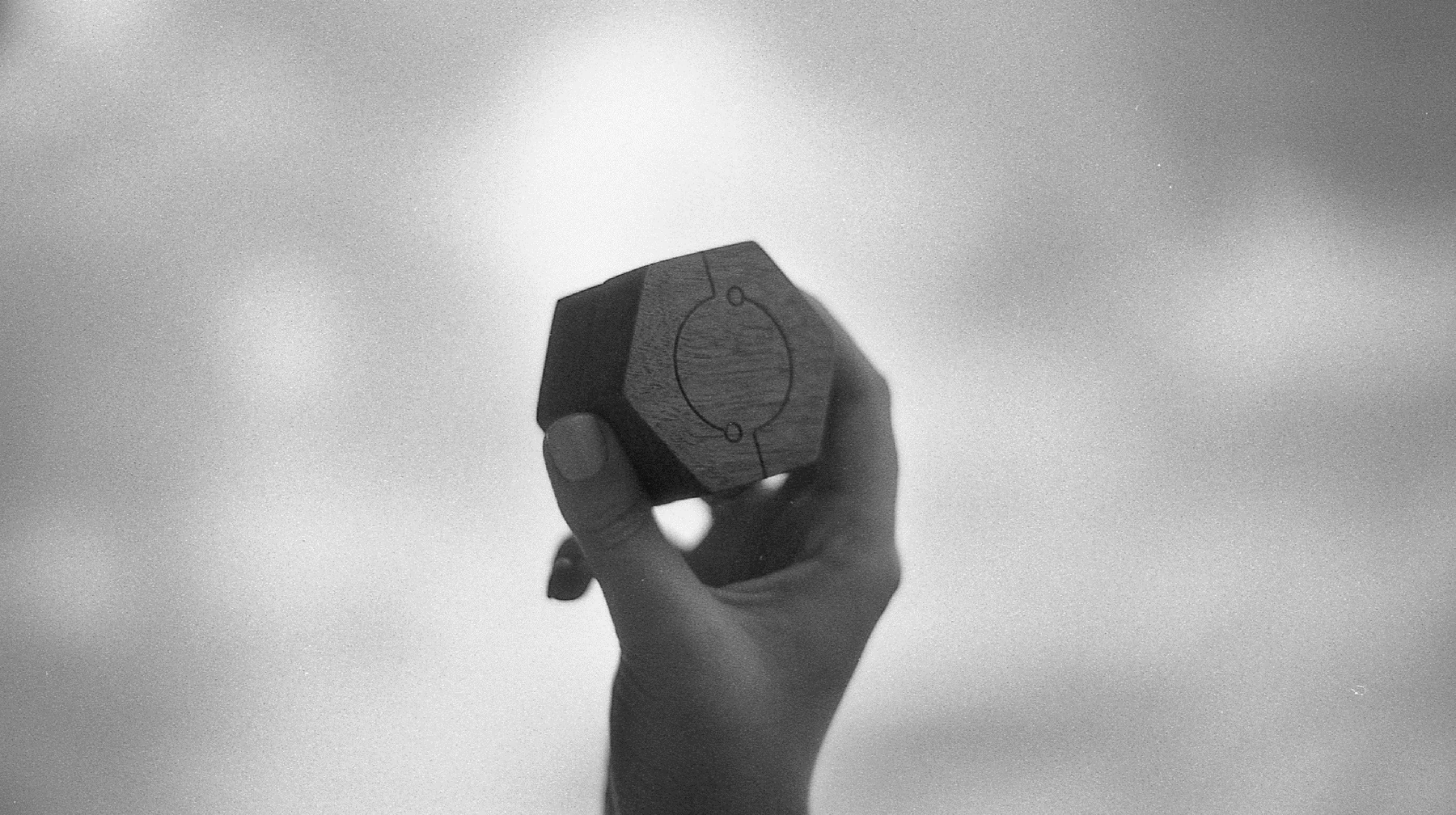
Black-and-white analog photography is a core part of the identity, not an afterthought. Grain, shadow and imperfect light keep the communication close to material, touch and memory.
The images focus on hands, scale and use. Instead of idealised showroom styling, they show the objects being held, opened and lived with.
Enclosed demonstrates a system-led approach in which brand idea, material choice, interaction, graphic language, packaging and photography reinforce one another.
Its value lies in consistency across scales: the same principles guide a mark, a textile repeat, an opening gesture and a physical object, creating a brand that feels coherent without becoming rigid.
Co-created with Konrad Kordas across brand concept, visual identity, graphic applications, product design, prototyping and presentation.