DONOR APP CONCEPT
A clearer
journey for
donors.
An exploratory mobile experience bringing donor information, reminders and ways to stay involved into one place.
Making the donor
journey easier to navigate.
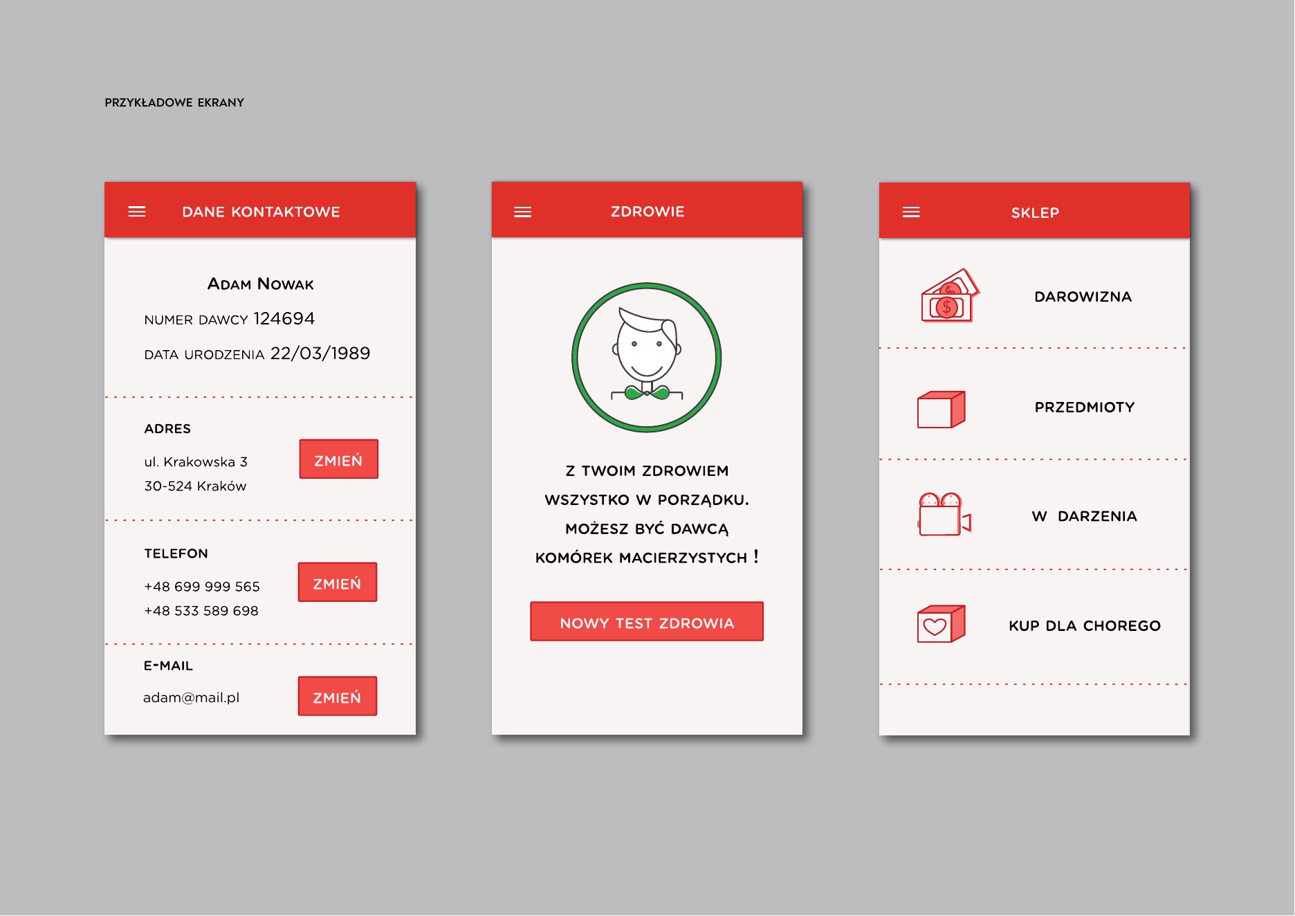
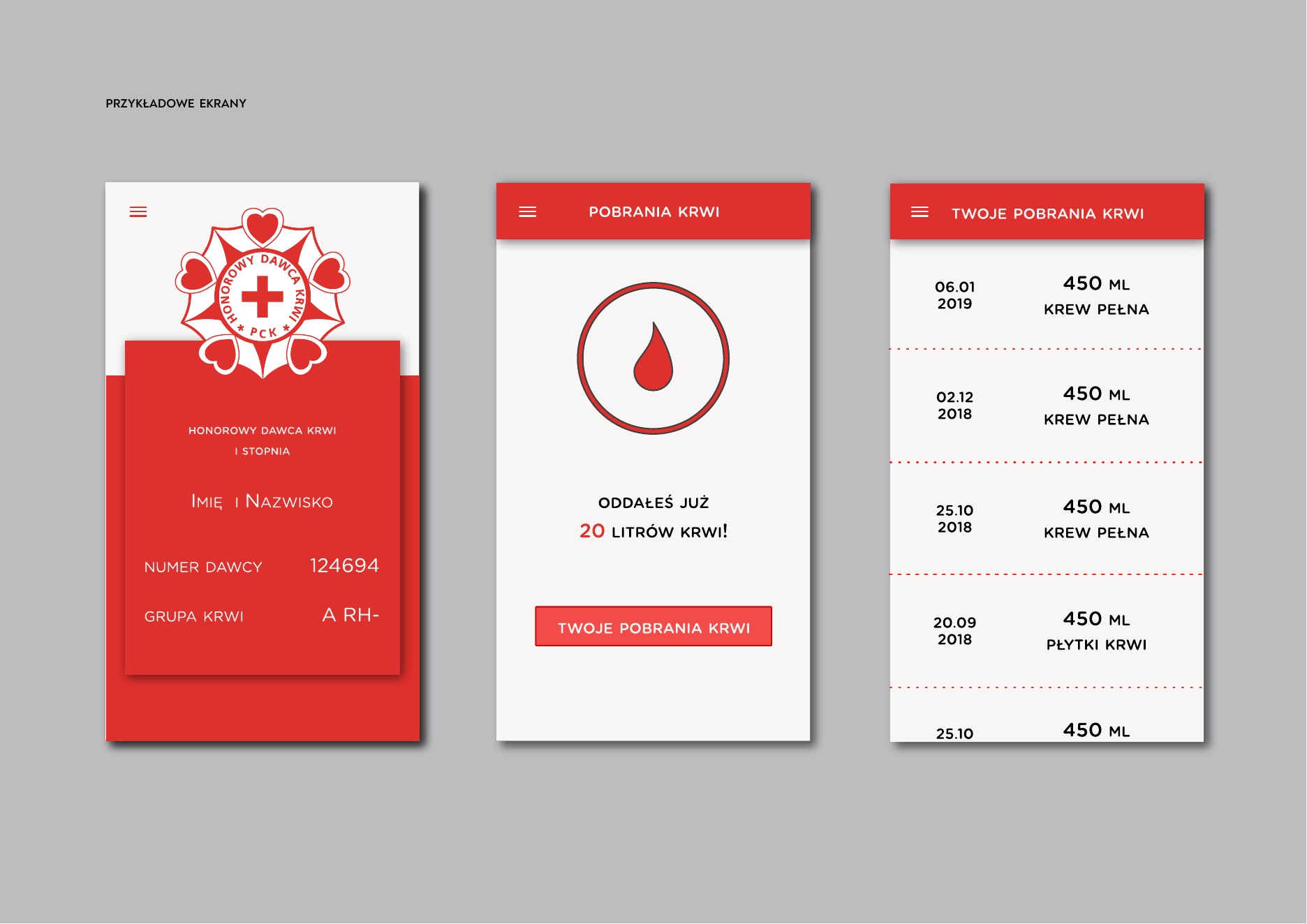
The concept explores one mobile place for blood donors and stem cell donors to manage contact details, view donor cards, follow health information, revisit donation history and discover opportunities to get involved.
illustrations, icons
An independent conceptual study associated with a DKMS competition. The interface shown here is a design proposal, not a released product or an official commissioned service.
From a complex process
to a connected experience.
Listen
Donor observation and interviews, supported by market analysis, helped map needs and existing friction.
Frame
Persona, journey mapping and a value proposition canvas gave the concept a clear structure.
Organise
Information architecture and wireframes brought the key donor tasks into a navigable flow.
Explore
Interface screens and prototype tests translated the proposed experience into tangible interactions.
Essential information,
within reach.
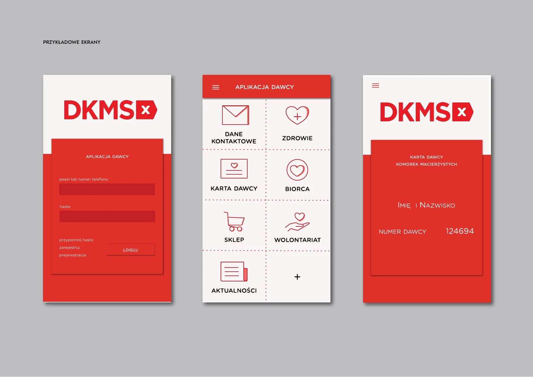
Three original screens show the concept’s entry point, navigation and digital donor card.
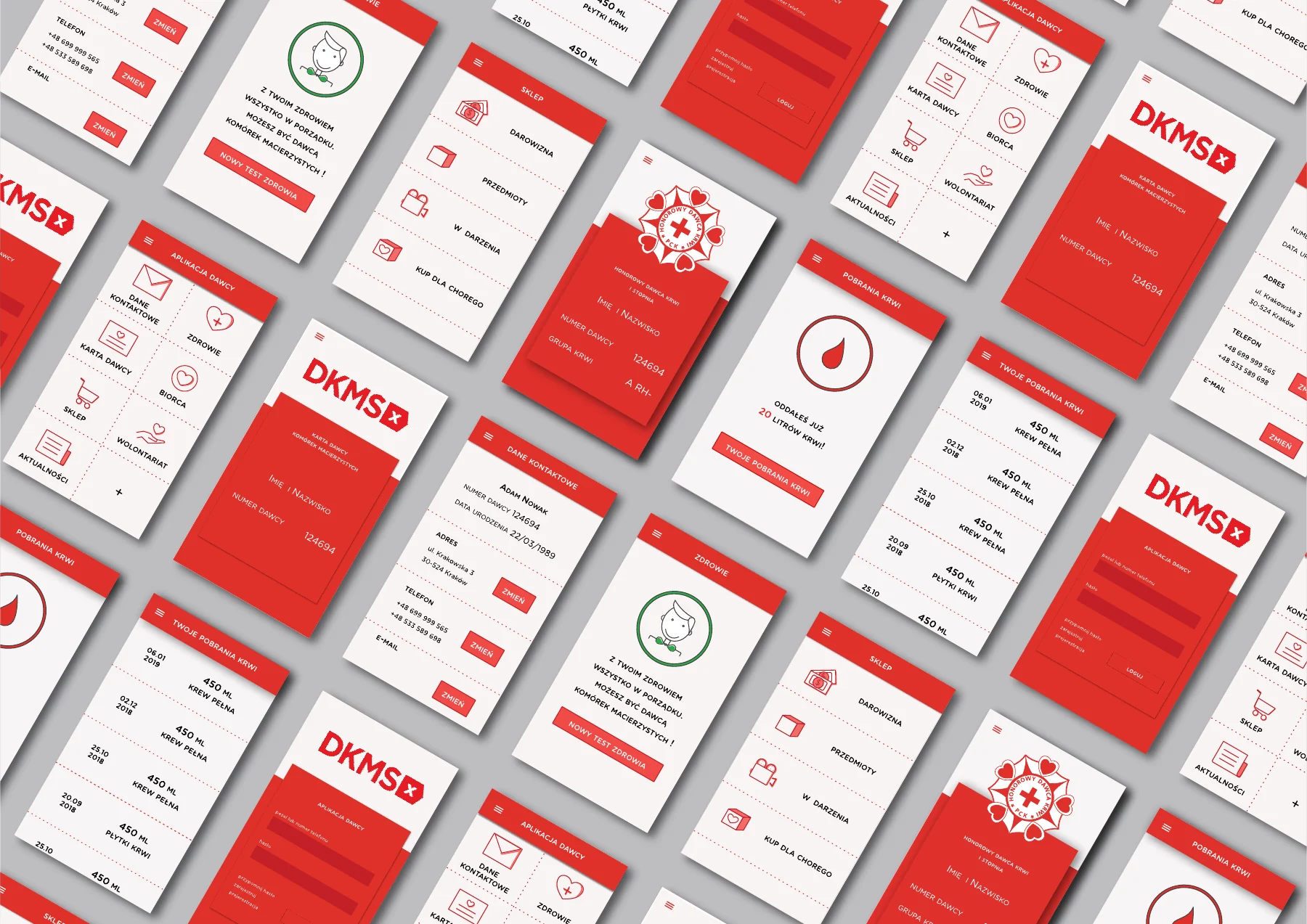
Original 2018 screen designs, presented in a contemporary portfolio mockup. The interface itself has not been redesigned.
A distinct, useful
visual language.
The screen set uses compact cards, simple pictograms and a clear red-and-white hierarchy to make different donor tasks recognisable at a glance.
A broader set of
donor touchpoints.
The concept extends from profile and health information to donation history and ways to support the organisation.