Saocal
One connected service for water-softener users and service teams.
A redesign of an existing digital system for remote water-softener management. The project brought customer and service workflows into one interface while also creating a coherent visual identity, illustration and icon system.
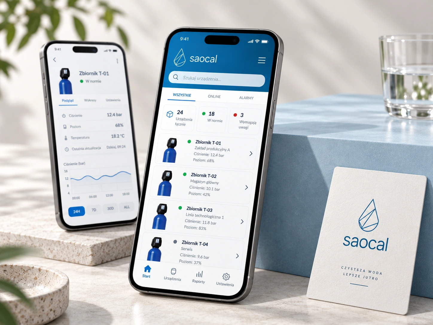
One system had to work for two very different users.
Saocal was designed for both people using water softeners and the technicians responsible for installing and servicing them. The service needed to make it possible to check and operate devices remotely while remaining understandable to non-technical users.
The project also had to improve an existing system rather than start from a blank page. That made understanding current workflows, pain points and available solutions an important part of the design work.
Understand the system before redesigning it.
Research covered users, sellers and service technicians, as well as the previous Saocal system and competing solutions. The aim was to identify the main user groups, understand their needs and assess where the existing experience was strong or weak.
The process combined observation and interviews with market analysis, customer-journey work, personas, Value Proposition Canvas, information architecture and prototype testing.
Observe real use
Look at how customers, sellers and service teams interact with the current system and the product around it.
Map different needs
Separate everyday customer tasks from the more detailed workflows required by service technicians.
Audit the existing service
Identify friction in the previous system and compare it with alternatives available on the market.
Test the structure
Use information architecture and prototype testing to check how the redesigned service should be organised.
Users, workflows, connected devices and the existing service context.
A clearer structure for customer and technician tasks.
Reduce complexity without removing capability.
The product goals were practical: make installation easier, create a more intuitive interface, improve communication with connected devices and bring customer and service workflows into a single service.
One service.
Keep the customer and service experience connected rather than treating them as unrelated products.
Make status visible.
Prioritise device lists, messages, notifications and clear connection states.
Work across screens.
Use the same visual and interaction language across mobile and desktop contexts.
Make the service easier to navigate without hiding the detail required for installation, diagnostics and remote servicing.
A recognisable language built around water.
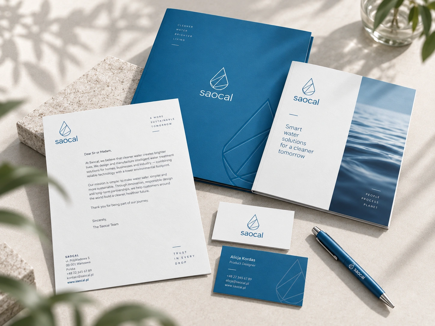
The digital product was accompanied by a visual identity system including the Saocal mark, illustration and a custom icon language. The same geometric vocabulary appears across the service and product communication.
Keeping those elements consistent helped the interface feel like part of the product rather than a separate software layer.
One structure across mobile and desktop.
Mobile supported recurring customer checks, messages and device notifications, while desktop provided a broader workspace for lists, status information and remote service actions.
Both versions share navigation logic and visual cues: recognisable device imagery, consistent status indicators and a common icon language connect the customer and technician workflows.
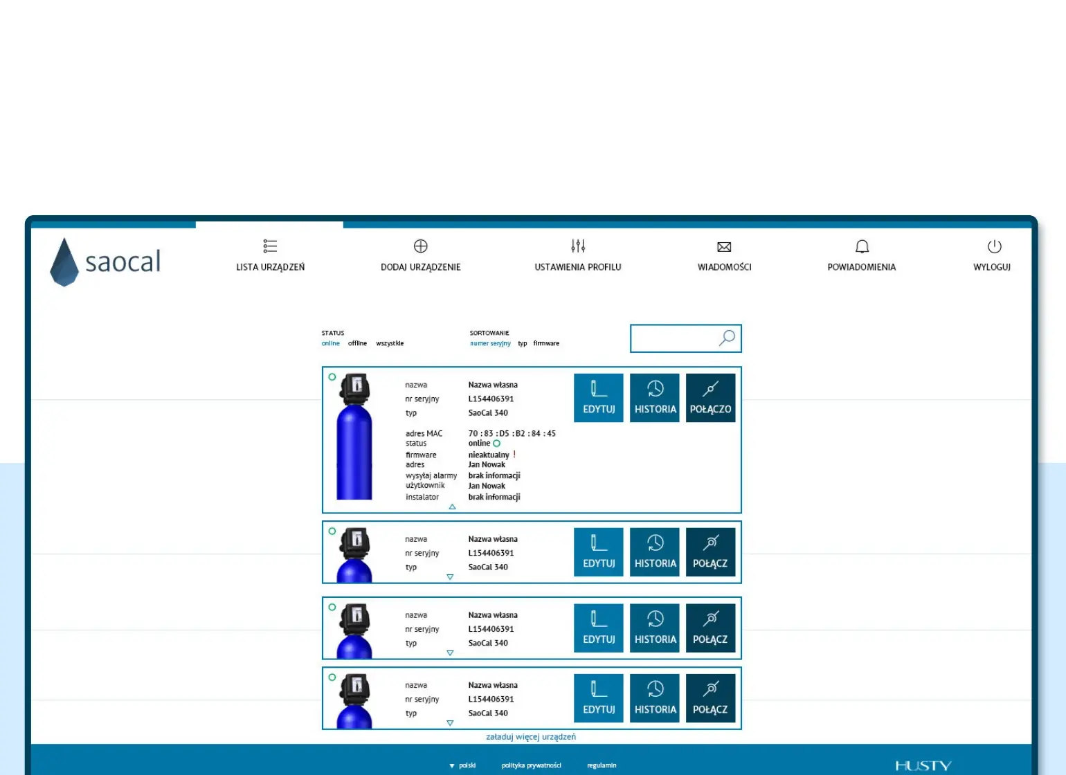
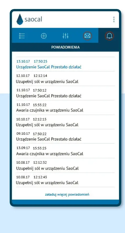
Original project screens, 2017–2018. Open an image to inspect the interface at full resolution.
Identity and interface designed as one product language.
I connected the brand mark, custom iconography, device imagery, navigation and interface colours within one visual system. Each element supports the same service across customer and technician touchpoints.
The interface does not sit apart from the brand; it extends it.
The project brought product thinking and graphic communication together in one service.
Research, identity and product thinking in one system.
The project covered analysis of the previous service, research, UX and UI design, branding, illustration and iconography. It was developed in collaboration with company employees, sales teams, customers and the product developer.
Existing-system analysis, user and market research, UX, UI design, information architecture, prototyping, visual identity, illustration and icon design.